- 1881 Whipple Rd. Hayward, CA 94544
- 510.264.9246
Pad Printing On Textured Surfaces
by John Kaverman
Plastics Decorating Magazine, Technology Feature July-August2007
http://plasticsdecorating.com/articlesdisplay.asp?ID=69
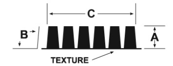
Textures vary according to their individual depth, the degree of draft on the sidewalls, and the frequency of peaks and valleys for a given surface area. Some textures are more difficult to print successfully than others, and there are certain textures that are simply impossible to cover completely.
The following diagram illustrates the three variables mentioned above. Dimension A represents the depth of the texture, B represents the draft angle of the sidewalls, and C represents the frequency. (Typically, the deeper the texture, the higher the angle of the sidewall to allow the part to release from the mold.)
The Experiment
In an attempt to find a correlation between these variables and printability, a series of sixty-odd black ‘visual texture standard’ plaques, provided by Mold-Tech, was printed as a test. The plaques were molded out of ABS (Acrylonitile-Butadiene-Styrene). An automotive-approved, two component, white ink-thinned 15 percent by weight; a steel cliché with an etch depth of .001”; and a 60 durometer (Shore scale A) transfer pad were used. Each plaque was single-printed at one end and double-printed on the other, then allowed to dry per the ink manufacturer’s recommendation.
Each single- and double-printed image was visually inspected for coverage under a uniform, non-directional (unfocused) light source at a distance of 18” for approximately ten seconds (per Ford Motor Company visual inspection procedure for automotive interior parts). Acceptance or non-acceptance was determined by the presence of any visible defect or void resulting from insufficient coverage of the texture.
The results indicate that the frequency of the texture plays a significantly larger role in achieving an acceptable print than the depth of the texture or the angle of the sidewalls. One texture having a depth of .0055” and 8 degrees draft was successfully single- and double-printed, whereas another texture that was only .0015” with 2.5 degrees draft couldn’t be printed successfully at all. The difference was the number of peaks and valleys in the texture within the image area. The obvious conclusion: the higher the frequency, the lower the likelihood of acceptance.
The data from this experiment only covers a limited number of known textures in a sea of millions. Unless you’re considering printing a part that came from a mold textured by Mold-Tech, it doesn’t help much. So how can you determine if your texture is printable? Print it yourself.
Determining Printability
In experimenting, it is important to use a machine, cliché, ink formulation, transfer pad, and cycle time that accurately represent what you plan to do in production. For example, a machine that generates more compression than the machine you intend to use for production may compress the pad further into the texture, resulting in an acceptable print that your production machine can’t recreate. The type of cliché, the size and depth of the image also need to be as real as possible, as does the ink formulation (i.e., ink : hardener : thinner ratio). Finally, use the same pad shape and durometer as will be used in production to conduct the test. Set up the test machine to run with production settings for speed and compression. When starting out, set the compression on the cliché and the substrate at the minimum amount necessary to pick up and transfer the image.
If you can’t get an acceptable print using the process you prefer, there are several variables to change. The easiest thing is to try a harder pad. Contrary to what logic would dictate, a harder pad penetrates the texture further than a soft pad does before the ink releases.
If a harder pad doesn’t do the trick, try slowing the speed with which the pad compresses on the substrate. This can make the displacement of the air in the valleys of the texture more efficient, leaving less potential pinhole-causing air under the ink film. Allowing the pad to dwell on the surface of the substrate for a few seconds may achieve the same results. Some machines, such as those with a programmable stepper motor, can be programmed to do this. Other machines require that the pad be over-compressed on the part, resulting in the machine actually stalling out. This can result in image distortion or worse yet, undue wear and tear on the machine, the pad, and the part being printed. In the event that the pad doesn’t work regardless of the durometer being used or how it is compressed, perhaps you need to experiment with one having a different angle - the steeper the angle, the better. On finely grained textures, if you fail to cover the texture with a single pass, the chances of covering it with a second pass aren’t very good. This is because the thickness of the ink layer only makes the voids (or valleys) that much deeper than they were initially. When this occurs, revert to ‘bridging’ the texture, rather than continue trying to fill it in.
Bridging Textures
Bridging textures can be achieved by changing how the ink film releases from the pad. If you are lucky, this can be achieved by simply using less thinner, or by slowing down the machine so as to allow more solvents to evaporate from the ink film while it is on the pad. This increases the tackiness of the ink, making it leave the pad in favor of the substrate sooner. When the ink releases sooner, it adheres more to the peaks and less down the sidewalls and into the valleys of the texture. In the event that you can’t sacrifice the speed, you can try directing some low velocity airflow to the surface of the pad in between image pick up and transfer. The increased airflow accelerates evaporation of the solvents. If you’re double printing, you also may wish to direct some air at the surface of the part to dry the first hit a little before the second pass.
Bridging textures can result in the dried ink film having less mechanical resistance, especially when the texture is a deep one. Since the ink is really only adhering to the peaks of the texture, there are tiny voids under the ink film in between. Ink that becomes brittle can fracture at these points more easily. Therefore it is important to keep the end use of the part being printed in mind when you’re deciding to bridge or not to bridge.
Finally, some textures are just plain impossible to cover completely. In these cases, it is necessary for the texture to be modified to make it printable. This typically isn’t up to the decorator; it is up to the people manufacturing the parts. If you’ve conducted some of the simple experiments outlined in this article, you’ll be better able to communicate the reasons why the texture in question isn’t printable, and your findings will undoubtedly be an asset in determining what the texture should be.
Click here for a Texture Test Chart showing the results of more than 65 texture tests determining printability given normal, average operating parameters.
John Kaverman is national sales manager for Innovative Marking Systems, the exclusive U.S. distributor of TOSH (Italy) Pad Printing Equipment. Kaverman has nearly 20 years of screen- and pad-printing experience. For more information, email john@padprinters.com.
Textures vary according to their individual depth, the degree of draft on the sidewalls, and the frequency of peaks and valleys for a given surface area. Some textures are more difficult to print successfully than others, and there are certain textures that are simply impossible to cover completely.